
What Makes a Wedding Venue Website Convert (And What Quietly Kills It)
A pretty website doesn't make a couple book.
A clear one does.
I'm Mark from GoEngage — and our dedicated platform for venues, VenueBot. In this article I'll walk through what separates the venue websites that convert from the ones that just look nice, and the specific things to fix this week.
What couples are actually looking for (by stage)
Couples don't visit your website once. They visit three times, sometimes four, and they're looking for different things at each stage.
Early. Style, location, rough budget and guest count fit. They want to know in 5 seconds whether you're worth shortlisting.
Middle. Detail on spaces, packages, logistics, reviews. They're now serious. They want to know if the venue can actually fit their wedding.
Near decision. Reassurance. Real weddings, named testimonials, clarity on the booking process. They've narrowed it down. They want certainty.
A great website serves all three stages without making the couple work for it.
A weak website serves one stage and assumes the couple will figure the rest out.
The 5-second test
Bridebook research shows couples shortlist on first impression in seconds.
Five questions every wedding venue homepage has to answer instantly:
- Who you are. What kind of venue.
- Where you are. Region, town, drive time from the nearest city.
- What you offer. Type of wedding, scale, ceremony options.
- Who it's for. Style, atmosphere, ideal couple.
- What to do next. Book a viewing, download the brochure, check availability.
If a couple can't answer all five inside 5 seconds, they leave.
Most venue homepages fail two or three of those.
The 12 elements every high-converting venue website has
Across the venue websites we've audited, the high-converting ones share twelve specific elements. Almost without exception.
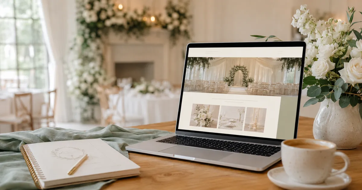
1. Hero image or video showing real wedding atmosphere. Not an empty shot of the building. A real wedding, with real people, in full atmospheric mode.
2. Headline naming venue type and location. "Modern barn weddings in the heart of Kent countryside." Not "Welcome to The Manor."
3. One primary CTA above the fold. Book a viewing. Or check availability. One. Not three.
4. Capacity and price range visible. Not behind a brochure download. Not "POA." A range, a starting price, or a guide. Bridebook's 2025 data shows 3 in 5 couples won't contact a venue if pricing isn't visible. Our own VenueBot Health Check data shows 41 percent of UK venues still hide their prices or share them only on request. That's almost half of the market filtering itself out before the couple even presses enquire.
5. Real wedding gallery, mixed seasons. Winter, spring, summer, autumn. Indoor, outdoor. Different scales. Different styles. Couples want to imagine their wedding here. Show them weddings like the one they're planning.
6. Testimonials with named couples. Not "Sarah, 2024." Sarah and Tom, with a photo, with a specific story. "From the moment we saw [venue], we knew it was the one." Specific beats generic, every time.
7. Awards and press badges. Hitched Wedding Awards, Bridebook awards, "Featured in" logos. Trust signals at a glance.
8. Clear navigation. Spaces. Packages. FAQ. Gallery. Contact. Five tabs at most. Don't make the couple hunt.
9. FAQ section answering the top 10 buyer questions. Capacity, ceremony options, accommodation, parking, accessibility, dietary, dog-friendly, weather plan, supplier flexibility, deposit. Couples are reading 9 to 10 reviews per venue (Bridebook) and they have specific questions. Answer them on the page.
10. Mobile-first layout. Most wedding browsing happens on phones, often in bed at 11pm. If the site doesn't work on a phone, the rest doesn't matter.
11. Sub-3-second page load. Slower than that, the bounce rate climbs sharply. Compress your images. Audit your scripts. Run a test.
12. Conversational enquiry option. Not just a 10-field form. A chat widget that answers questions and books tours inside the conversation. Forms still work for couples ready to enquire. Conversational AI captures the ones who aren't quite there yet.
If your website is missing four or more of those, you have a conversion problem before any couple ever picks up the phone.
What kills conversion
The opposite is just as clear.
Auto-playing music. Always wrong. Always.
Multiple competing CTAs. "Enquire now" and "Book a tour" and "Download brochure" and "Call us" and "Email us" all in the same hero section. Pick one. The others can sit lower on the page.
Long forms. Ten fields, mandatory phone number, four mandatory drop-downs. The longer the form, the lower the completion rate. Bridebook research shows couples are 60 percent more likely to respond to messages under 40 words. The same logic applies to forms — keep it short.
Missing pricing entirely. Already covered. Worth saying twice.
Stock photos pretending to be your venue. Couples spot it instantly. It tanks trust.
Slow loading. Self-explanatory.
Broken mobile layout. A surprising number of premium-looking venue sites are unusable on a phone.
The pricing question (because it always comes up)
Hidden pricing is the single most common conversion killer I see.
Venues hide pricing because they think it'll attract price-shoppers. What actually happens is the opposite. Couples don't avoid venues with prices. They avoid venues with uncertainty.
When pricing is hidden, couples don't think "this venue must be premium." They think "this venue is probably too expensive for us." So they don't enquire.
When pricing is visible, couples self-qualify. The ones who enquire already know you're in the right ballpark. Better conversations. Higher-quality enquiries. Higher conversion.
Four ways to show pricing without boxing yourself in:
- From pricing. "Weekend weddings from £7,500." Anchor without locking.
- Range pricing. "Most couples spend between £8,000 and £12,000 depending on date and guest numbers."
- Package pricing. Silver / gold / platinum. Clear. Easy to compare.
- Seasonal guidance. Off-peak / mid-season / peak. Removes friction instantly.
Pricing doesn't need to be perfect. It just needs to be clear.
How VenueBot Studio AI's Website Analyzer works
If you want a structured audit of your own website, Studio AI's Website Analyzer (one of the modules in the VenueBot system) runs a 15-category, 100-point audit.
It scores you across:
- Enquiry and lead capture
- Social proof and reviews
- SEO and discoverability
- Video and rich media
- Speed-to-lead infrastructure
- Trust and credibility signals
- And nine more
Each category gets a score and a detailed written critique. Not "this needs work" — specifically what's missing and what good looks like.
There's also an Impact Simulator that shows what your score would change to if you fixed specific issues. It's the same audit we run on our own clients. Built on 120+ research sources spanning Bridebook, Hitched, WedPro, The Venue Expert, HubSpot, Salesforce, Harvard Business Review, Google, and the Nielsen Norman Group.
What to do this week
Three quick wins.
First, run the 5-second test on your own homepage. Open the page. Wait 5 seconds. Close the tab. Then ask: did the page answer all five questions (who, where, what, who-for, what next)? If not, fix the hero section first.
Second, add capacity and price range to the homepage. Even a "from £" anchor. Even a "most weddings here are between £X and £Y." If you don't, you're filtering yourself out.
Third, take the Wedding Venue Health Check. Three minutes, fifteen questions. The output tells you which website gaps are most likely costing you bookings.
Your website isn't a brochure.
It's your hardest-working salesperson, working 24 hours a day, in front of every couple at every stage.
Sources and further reading
- Bridebook UK Wedding Report 2025 — bridebook.com
- Nielsen Norman Group on conversion psychology — nngroup.com
- Google customer journey research — thinkwithgoogle.com
- HubSpot marketing science research — hubspot.com/research
- VenueBot Wedding Venue Health Check (proprietary research, n=200+ UK venues) — quiz.venuebot.io/healthcheck
If you'd like to see how Studio AI's Website Analyzer scores your specific site, book a 15-minute walkthrough. We'll run the audit live and show you exactly where the gaps are.
If this was useful, share it with a venue owner who's wondering why their site isn't converting. They'll thank you.